Behind the Project: Why do Certain Countries Drive on…


Brief:
A self directed exploration into learning how to create a carousel post.
Find a purpose (entertain, inform, educate etc) with a subject and create a post.
Subject:
There were several different topic ideas to choose from: Geography (world time zones), technology (two/multi-factor authentication), design (software tips) and logic (paradoxes). I chose this topic because it has universal appeal to engage more viewers and a linear narrative can be built from historical events.
Structuring:
The next challenge was simplifying and story boarding a mass of information into ten or less pieces that was easy to follow. I had a natural beginning with the Romans building the first roads, through to the French Revolution as well as several events I can create a chronological narrative with. Panels were rearranged, deleted, and replaced for better storytelling. I curated the information to the most significant and interesting events and ended with an allusion to the future whilst acknowledging there’s more on the subject.
Style:
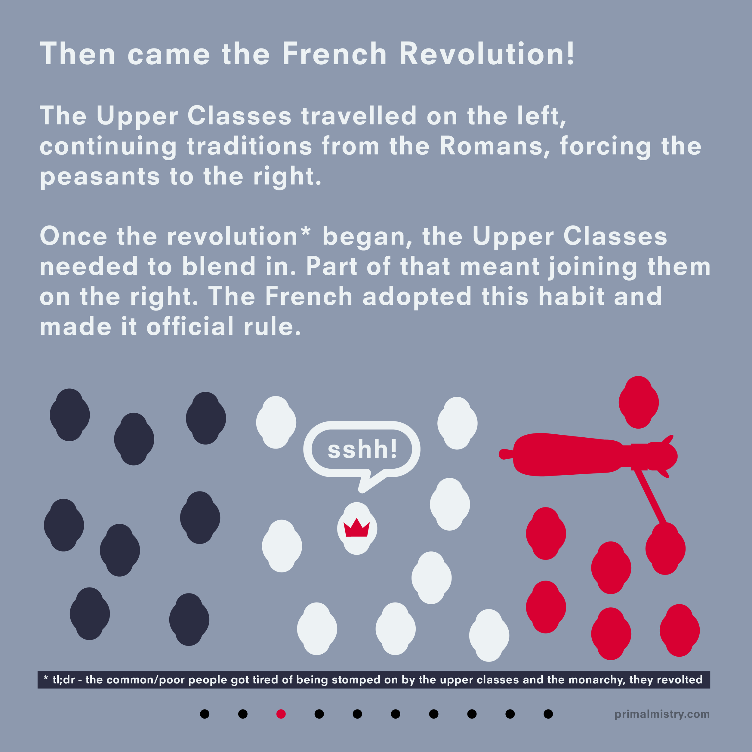
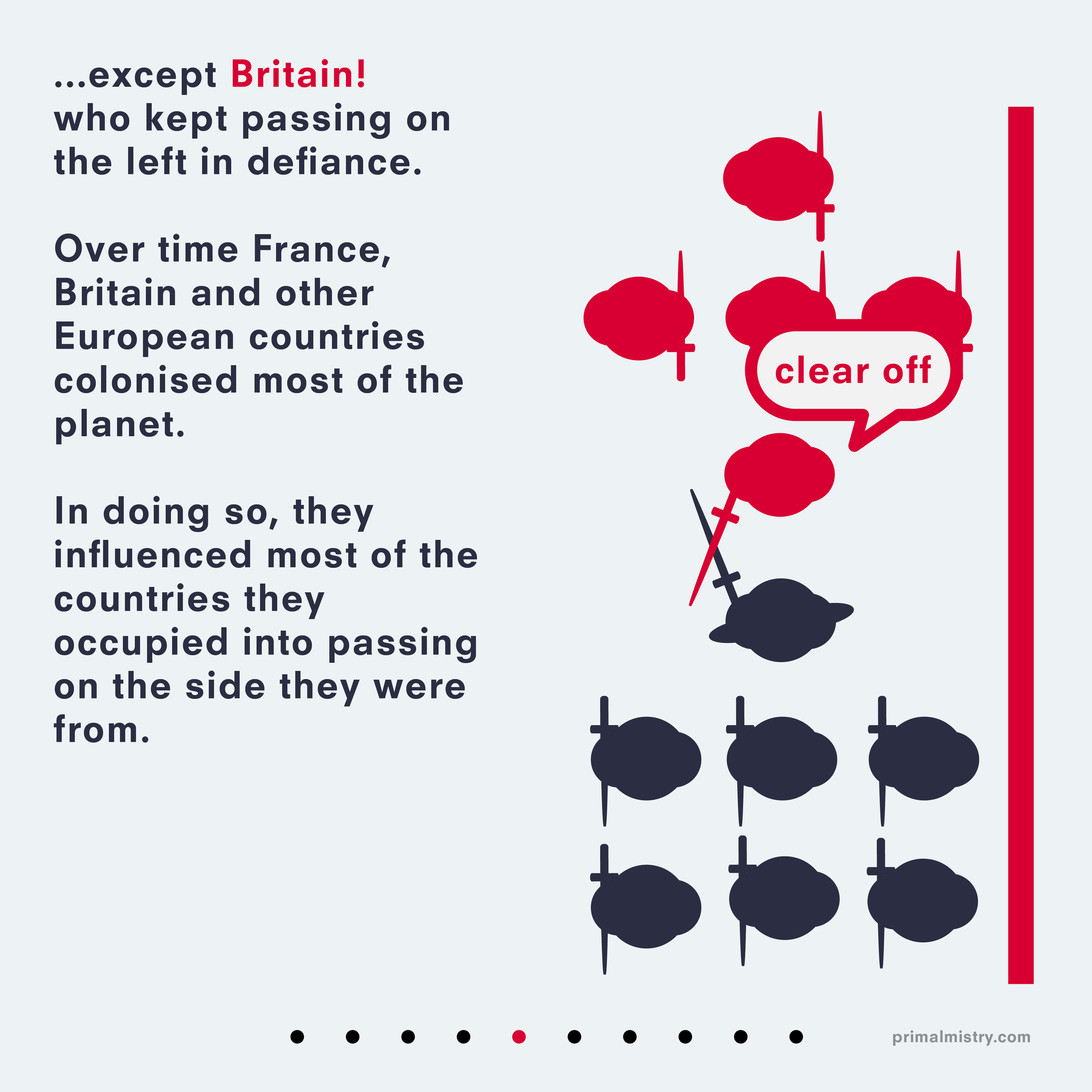
Once I had a basic structure, the next step is creating a visual language. I needed was a page indicator. This took the form of dots at the bottom of the page: ten dots at the bottom - nine in a semi transparent grey and one in a highlight colour to show what page it is. Font choice - I chose Neuzeit S LT Bold. This font on my website and other media, so here it maintains uniformity. I used Anton for the title page because thick bold letters are reminiscent of road markings. For consistency, I need a strong colour palette. I chose one on the Adobe Colo(u)r site, which had two shades of red, two of blue and a light grey. Red and blue feel opposite which was ideal to represent opposite sides of the road. Communicating these ideas needed illustrations to accompany the text and certain points needed human like characters, I created some with circles and framed most of the illustrations from an aerial point of view. As the shapes are symmetrical, I relied on positioning and events in the rest of the scene to add context to what they were doing. The only special character was Napoleon, which I added a crude curved hat for differentiation. From there, I developed a minimal style. To communicate which side of a path the characters are travelling on I used a thick line to represent a wall/edge of a path. As another way to express myself, I want to incorporate humour. I stumbled upon using a speech bubble to add a “moment” in the illustration for the French Revolution panel where a monarch was blending in with the public, broke the fourth wall by sshing the viewer. I liked added that technique to every panel. I also wanted to add a hidden Easter egg in the panels as well so any panels introducing a country (except Sweden) had a hidden flag os said country - France, England, the USA and Japan.
Evaluation:
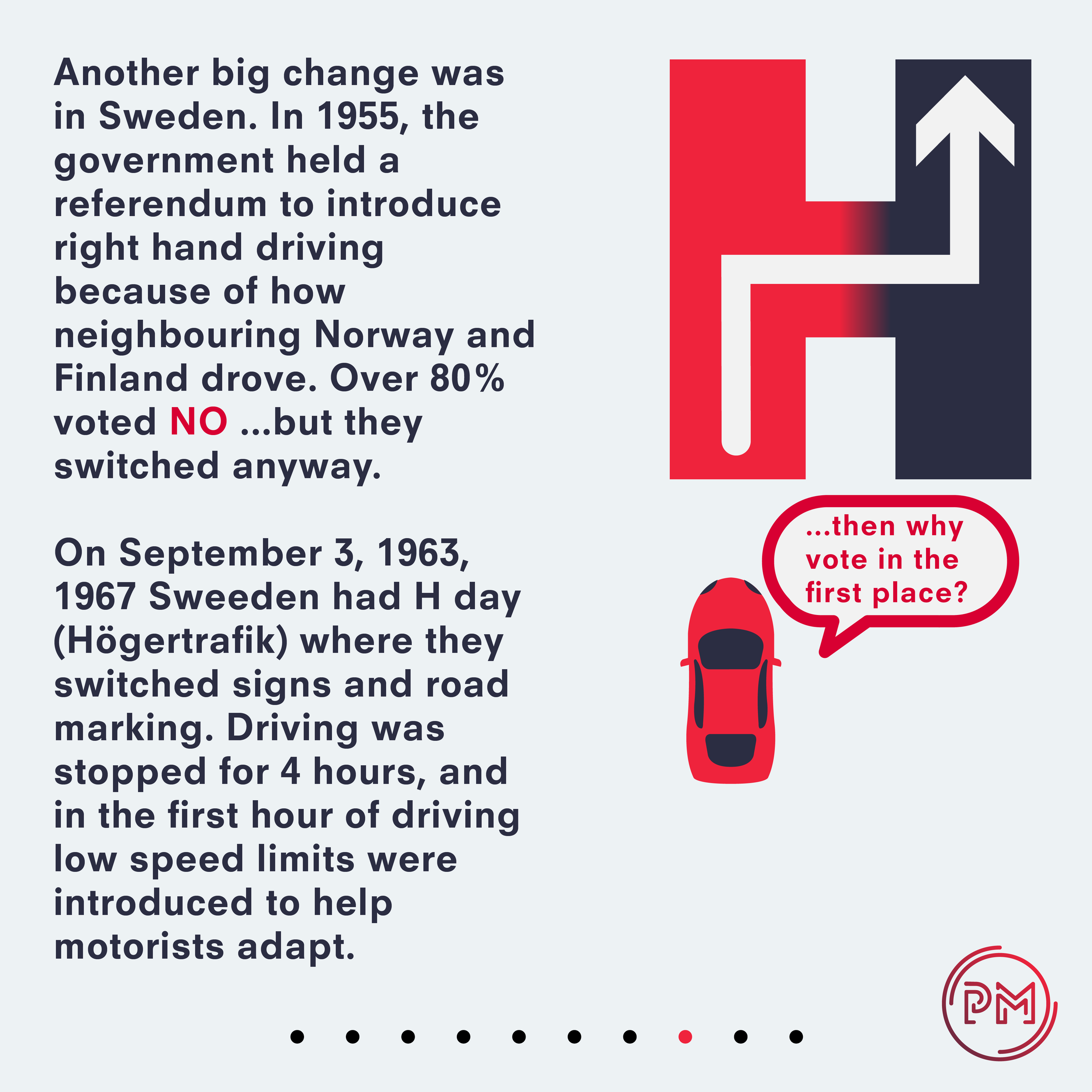
For a first attempt at a post like this, I feel it was successful. It was visually striking, explained the title point thoroughly and was engaging throughout. However, everything can be improved. The final few frames felt like they strayed from the art style of most of the earlier frames; the gradient in the H could have been executed differently and the thank you message on the final page was bulky and distracting. I would also reduce the panels to 9 maximum so there is an extra panel in hand; there’s more elegance in using a square number (3x3) to display the square panels on the same canvas and I would have trouble sharing it on LinkedIn, who only allow nine photos in one upload. I could have done more research in how the horse buggy carriages were set up, something about them looked off. Theses are points to think about when moving further with future projects.
