A Tale of Two Styles


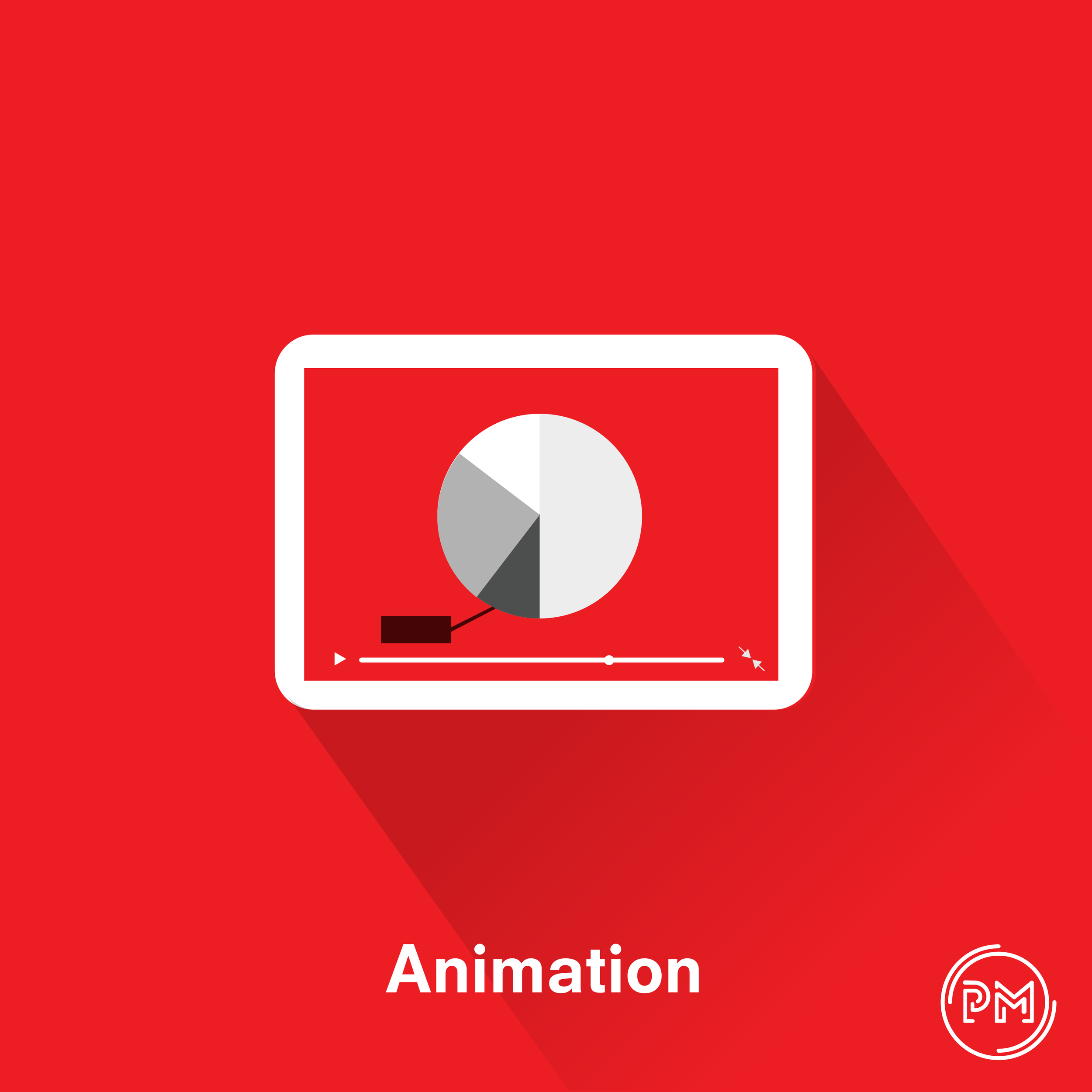
So I was going through my hard drive and found this. An old piece where I was emulating flat design, which was current at the time with a simple subject - a tablet playing an infographic video captioned "Animation".
Naturally I opened the ai file and began tinkering. I created a significantly improved version which kept most of the original elements. The shadow was fully expanded to the corner and faded out before it reached; I changed the font and PM; made the anmation full screen, added details and removed anything unneccesary.
Trends are different now. Neumorphism is the new trend. Simply put, this is taking skeuomorphism (making assets in a graphical user interface accurately look like what they represent e.g. the camera app on original iOS looking like an actual lense) with a modern twist - subtle uses of gradients and shadows to look like semi realistic. It almost looks like the device is sunk into the background or being pushed through from the other side
I created a neumorphic version and honestly, I prefer the updated flat design. Flat feels timeless, Neuomorphic feels like it will be dated to this period, but who knows….
What do you think?
